RECESS HOTEL
BRAND IDENTITY
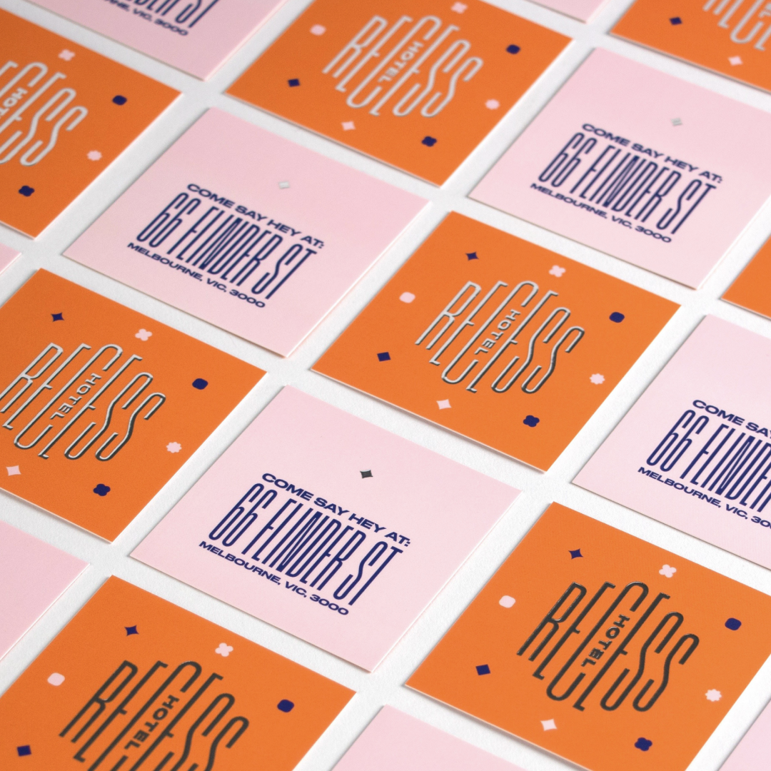
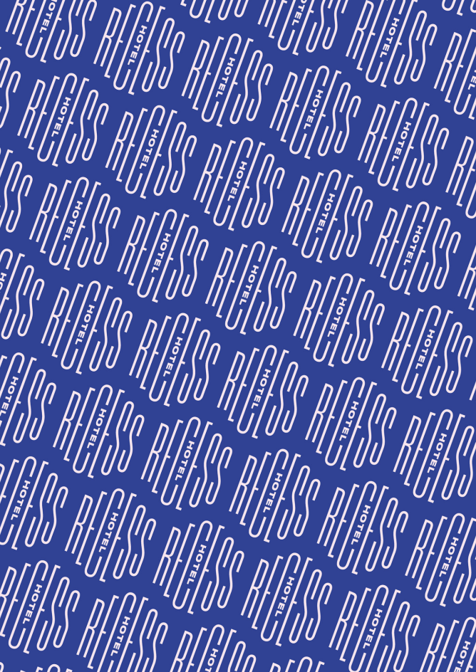
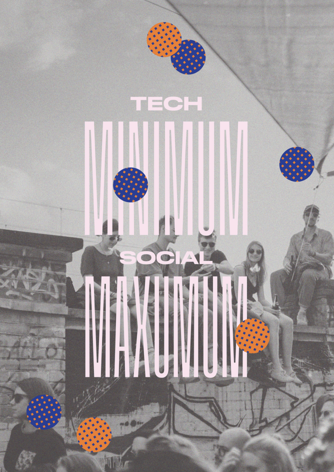
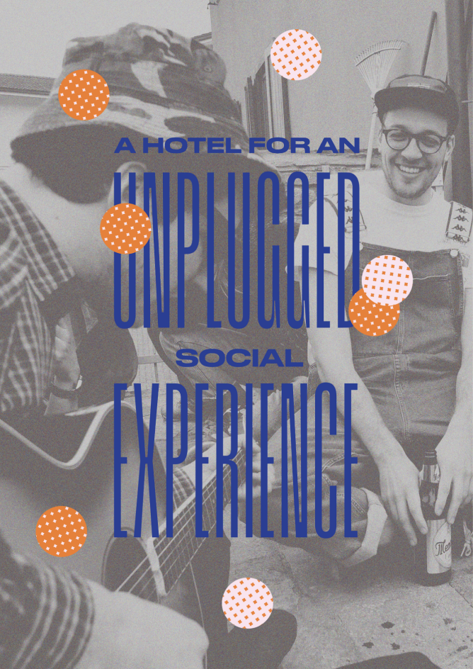
Recess Hotel is not just a place to stay, it's a unique destination offering a refreshing break from the digital world. The logo design is a perfect visual representation of the brand's philosophy, combining a slender, elongated font with a plump, wide font, symbolizing unity in diversity. The custom stamp-like shape of the logo adds a touch of authenticity and originality to the brand. The graphic elements in the design, portraying an abstract community with a variety of similar shapes, signify inclusivity and diversity. These elements can also be interpreted as representing introverted and extroverted personalities, conveying the message that everyone is welcome. The carefully chosen color scheme is contemporary, gender-neutral, and high-contrast, further emphasizing the brand's modern and inclusive values.
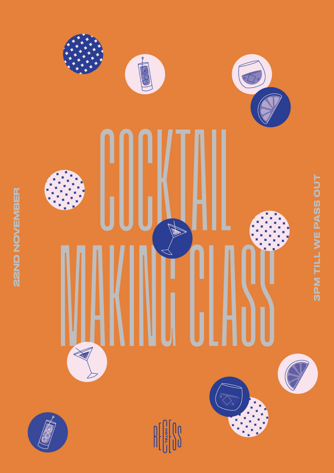
To make these A3 activity and values posters feel welcoming and approachable, I crafted a friendly and light-hearted language that captures the essence of the events. The main concept was to use visually appealing scattered stickers that effectively convey the theme of each activity. For instance, number balls for bingo, drinks for the cocktail class, and materials for the 'anything but clothes' party. This creative approach adds a playful and engaging element to the posters, making them more likely to attract the audience's attention and spark their interest.




I designed these innovative beverage cans to double as a playful game within the hotel. Once you get one, the goal is to find the person who has the matching half of the label. Stretching the typography is a signature element of the brand identity, giving the cans a distinctive and dynamic look. To enhance the playful and interactive nature of the game, I incorporated an interweaving arm graphic on the labels. The arms eventually converge and shake hands, just like how people greet each other when meeting for the first time. This creative touch adds a fun and memorable element to the brand experience, making it more engaging and enjoyable for hotel guests.
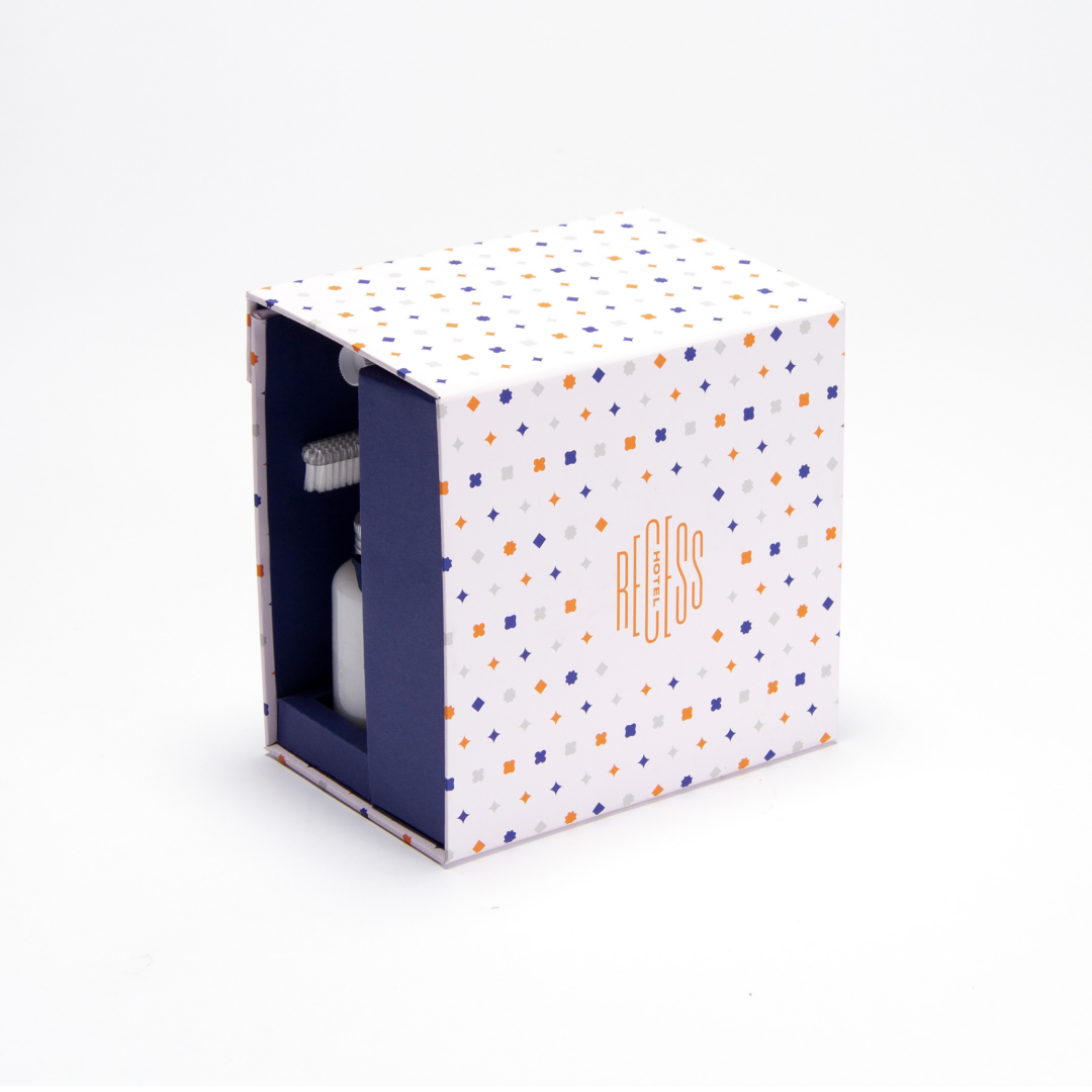
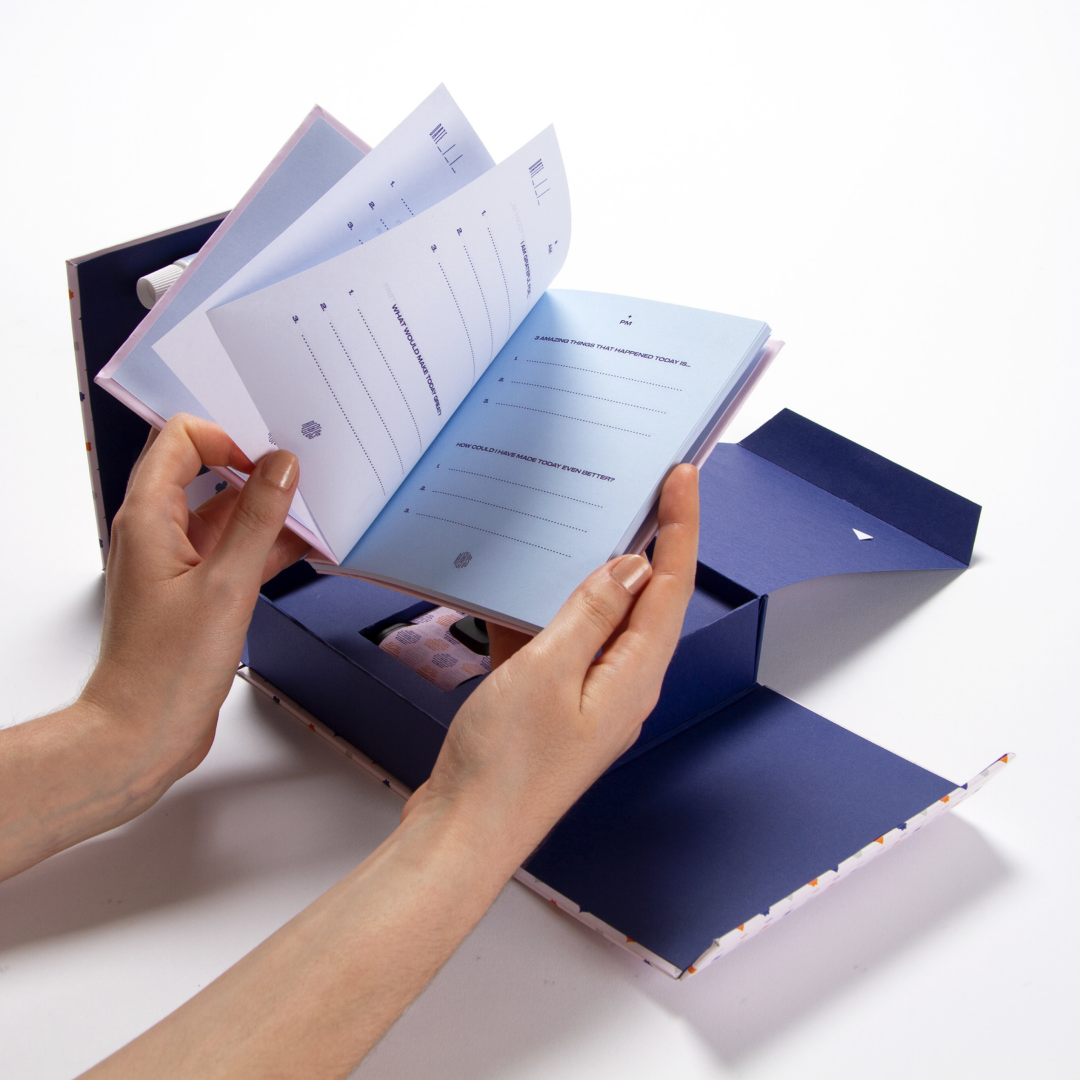
I created a unique and thoughtful mini-kit to help hotel guests become their best selves during their stay. The package has been designed to fit the gifts and products perfectly and offers a novel and special experience to the guests as if they were unwrapping a present. Inside, guests will find an assortment of high-quality hygiene products to keep them feeling fresh and rejuvenated, as well as a beautiful journal to jot down their thoughts and ideas. Additionally, the kit includes a disposable camera, providing guests with a unique opportunity to capture their memories on film, rather than relying on their smartphones. This carefully curated kit goes above and beyond to make guests feel valued and appreciated, adding a personal touch that enhances their overall experience.

Selected Works

Brown BrothersAdvertising

Dairy FarmersAdvertising

TargetAdvertising

SpecsaversAdvertising

Cash ConvertersAdvertising

GrainshakerAdvertising
YoplaitAdvertising

3D AnimationProject type

